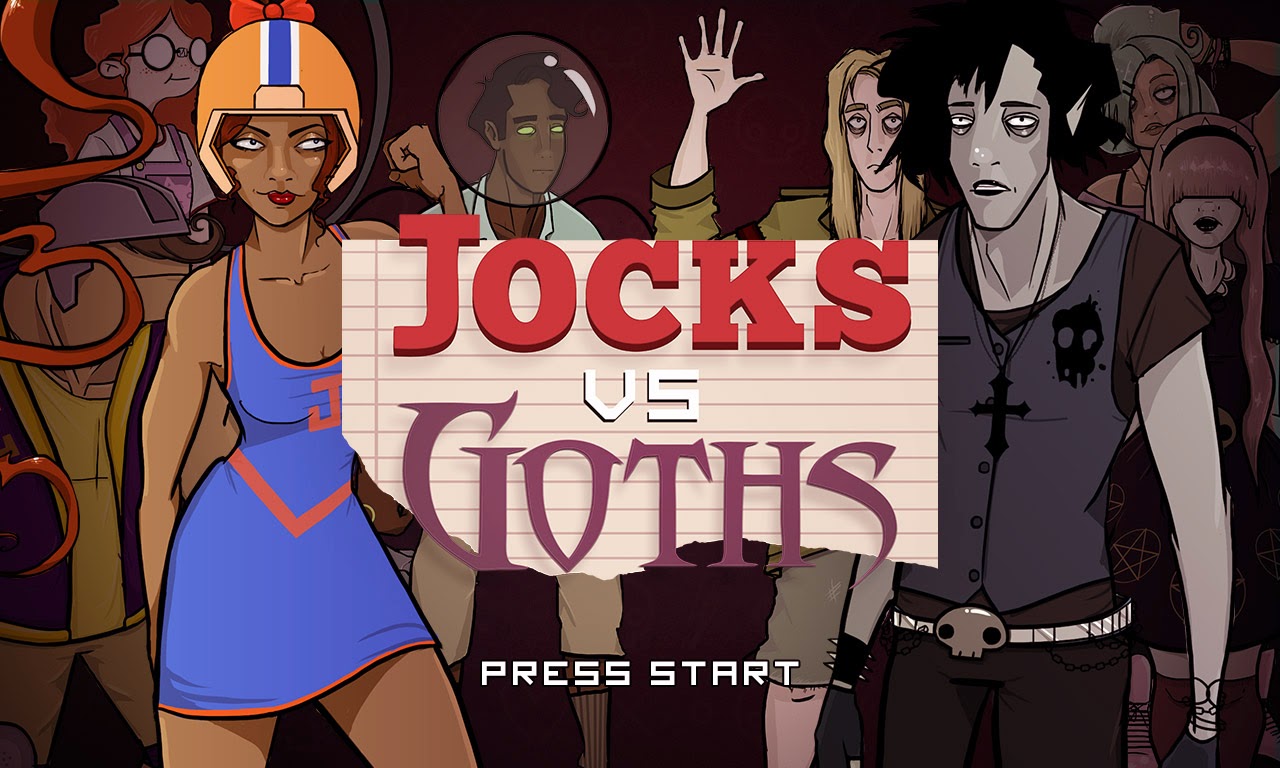
Thursday 15 May 2014

Health/Special Bar


For the health bar design I started off by trying to come up with interesting shapes.

I stuck to the standard non-diagetic health bar style HUD of a fighting game.  "Non-diagetic" is a term first coined by Erik Fagerholt and Magnus Lorentzon in order to state how linked an in-game interface is to the gameplay narrative.  Having this style of UI allows for “elements [to] have the freedom to be completely removed from the game’s fiction and geometry and can adopt their own visual treatment.” (Stonehouse, A. 2014) However Stonehouse, A suggests “non-diegetic elements still inherit the visual style associated with the game world.”

For this reason I still want my UI to inhibit the general school 
rivalry theme of "Jocks Vs Goths" which is the reason behind choosing to design my health bars as if they were resting on scraps of lined, school jotter paper.  I feel the torn paper aesthetic also compliments the "scrappy" nature of a fighting game, especially one set in a school yard.

--------------------------------------------
Further reading on non-diagetic UI:
http://gamasutra.com/blogs/AnthonyStonehouse/20140227/211823/User_interface_design_in_video_games.php  

Essay Notes

As my project slowly began to drift away from the exploration of polished 2D art assets for game development and began to specifically focus on establishing an art direction for a 2D fighting game, particularly in regards to character design, it was advised I change my research question.
As a result I have changed my research question to:

"
What methods are used to establish an effective and appropriate visual style for a 2D fighting game?"
The following contains notes for the structure of my essay and reference materials researched throughout the year that informed my project. 


Contents


1. Introduction


2. Research

2.1 Fighting game genre general background and current state.
2.2 Art Styles Typically Used in 2D Game Development
2.3 Art Styles Typically Used for Particular Target Audiences

3. Methodology3.1 Visual research
3.2 Character Design
3.3 Environment Design
3.4 Graphic Design

4. Conclusion

5. References

6. Bibliography


Saturday 10 May 2014

Menu Screen Ideas

Some ideas for the menu screen.  I think I prefer the last one here - the crowd of characters gives it a more fighting game sort of feel.


Research - Fighting Game UI

Title screen


Loading Screens


Main Menus


Character select


In-game


------------------------
Title screens - Tend to be fairly minimal, usually a centered logo with a relatively simple background, sometimes featuring game characters posed in action stances.

Loading screens - Shows off concept art/characters in some way


Main menu - Can look cluttered with lots of text - in my design I will attempt to avoid this.  The graphic design of the menu screens seems to vary the most out of all the game's I have researched so far.

Character select - Icons of characters, usually centre screen, available for the player to select.  Characters, sometimes polished concept art, appear on the respective players' side when selected.

In-game - Health bars top right and left with selected character icon on outer edges, special moves gauge can be below health bar or at the bottom of screen.  Personally from my experience I find having them below the health bar makes them easier to see as all the information I need is in the one location.  Game time is centred at top of the screen.  Visual feedback communicating how well the player is doing etc appears when appropriate on the respective players' side of the screen.

-----------------------------

Though not all of these are fighting games, for inspiration I've also created a mood board consisting of general game title screens I find visually appealing.


References:

+ Blazblue: calamity trigger. 2008. [digital download, disc]. PC, Sony Playstation 3, Sony Playstation Vita, Xbox 360. Arc System Works.
+ Blazblue: continuum shift. 2009. [arcade, disc]. Arcade, Sony Playstation 3, Xbox 360. Arc System Works.
+Darkstakers: resurrection. 2013. [digital download]. Sony Playstation 3, Xbox 360. Iron Galaxy Studios.
+Darkstalkers: the night warrior. 1994. [cartridge, disk]. CP System II, Sony Playstation. Capcom.
+Marvel vs Capcom 2: new age of heroes. 2000. [disc]. Arcade, Dreamcast, iOS, Playstation Network, Sony Playstation 2, Xbox Live Arcade, Xbox. Backbone Entertainment, Capcom.
+Marvel vs Capcom 3: fate of two worlds. 2011. [disc]. Sony Playstation 3, Xbox 360. Capcom.
+Persona 4 arena. 2013. [arcade, disc]. Arcade, Sony Playstation 3, Xbox 360. Atlus, Arc System Works.
+ Skullgirls.  2012. [digital download, disc]. Sony Playstation 3, Xbox 360. Lab Zero Games, Reverge Labs.
+Street fighter. 1987. [arcade]. Arcade. Capcom.
+Soulcalibur V. 2012. [disc]. Sony Playstation 3, Xbox 360. Project Soul.

Friday 9 May 2014

Game Logo Design

With the game logo, I felt it was really important I got across the rivalry of the characters in the game.  For this reason I decided the fonts used for "Jocks" and "Goths" in the logo should really contrast.  I explored a range of different fonts - I looked at thin, elegant and somewhat horror-esque fonts for "Goths" and strong, bold, blocky Letterman style fonts for "Jocks."


I then selected my favourite fonts and create some quick layout mock ups.


I decided the typography looked too bare without a background and I thought the lined paper inspired pattern here fitted the theme of "high school" rivalry without being too distracting.  I was also initially going to added some illustrations to frame the text, however after some feedback I was advised "less is more."


Final Character Designs